Vulcan 2.13 enhances the generated code for the card views in horizontal carousels, utilizing modern APIs to minimize boilerplate code, create dynamic interfaces, and leverage native styling.
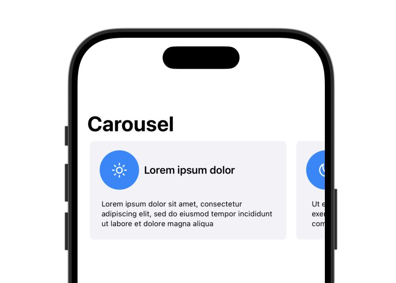
GroupBox and Label in carousel cards
Card views for carousels now use the GroupBox and Label views to take advantage of native styling and spacing, reducing the need for explicit layout code and view modifiers.
struct Card: View {
	let headline: String
	let caption: String
	let systemImage: String

	var body: some View {
		GroupBox {
			Text(caption)
				.font(.caption)
				.frame(height: 50, alignment: .top)
		} label: {
			Label {
				Text(headline)
			} icon: {
				Image(systemName: systemImage)
					.circular()
			}
			.padding(.bottom, 8.0)
		}
	}
}
The carousel code uses new layout view modifiers to size and place the contained card views.
struct ScrollingCarousel: View {
	@State var items = ContentViewScrollingCarouselItem.data

	var body: some View {
		ScrollView(.horizontal, showsIndicators: false) {
			LazyHStack(alignment: .center, spacing: 16.0) {
				ForEach(items) { item in
					Card(
						headline: item.headline,
						caption: item.caption,
						systemImage: item.systemImage
					)
					.containerRelativeFrame(
						.horizontal,
						count: 9,
						span: 8,
						spacing: 20.0,
						alignment: .leading
					)
				}
			}
		}
		.contentMargins(20.0)
		.frame(height: 160.0)
	}
}
Restored the upgrade button in the toolbar
A bug introduced in a previous update caused the upgrade button to disappear from the toolbar.