Vulcan 2.11 enhances the generated code for SwiftUI lists, utilizing modern APIs to minimize boilerplate code, create dynamic interfaces, and leverage native styling.
New initializer for editable lists
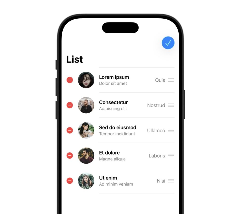
Editable lists now use the init(_:editActions:rowContent:) initializer introduced in iOS 16, removing the need for a ForEach view paired with view modifiers for moving and deleting list elements.
struct ContentView: View {
	@State var items = ContentViewItem.data

	var body: some View {
		List($items, editActions: .all) { $item in
			// ...
		}
		.listStyle(.plain)
		.navigationTitle("List")
		.toolbar {
			ToolbarItem(placement: .navigationBarTrailing) {
				EditButton()
			}
		}
	}
}
Label view in List rows
List rows now use a Label view to take advantage of native styling and spacing, reducing the need for explicit layout code and view modifiers.
struct Row: View {
	let headline: String
	let caption: String
	let systemImage: String

	var body: some View {
		Label {
			Text(headline)
				.bold()
			Text(caption)
		} icon: {
			Image(systemName: systemImage)
				.imageScale(.medium)
				.symbolVariant(.fill)
				.foregroundStyle(.white)
				.background {
					RoundedRectangle(cornerRadius: 6.0)
						.frame(width: 30.0, height: 30.0)
				}
		}
	}
}
Using a Label view also makes it easier to change the view layout dynamically using native and custom label styles.
struct Row: View {
	// ...

	var body: some View {
		Label {
			// ...
		} icon: {
			// ...
		}
		.labelStyle(.photo)
	}
}

struct PhotoLabelStyle: LabelStyle {
	func makeBody(configuration: Configuration) -> some View {
		HStack(spacing: 16) {
			configuration.icon
			VStack(alignment: .leading) {
				configuration.title
			}
		}
	}
}

extension LabelStyle where Self == PhotoLabelStyle {
	static var photo: PhotoLabelStyle {
		PhotoLabelStyle()
	}
}
Badge view modifier for text accessories
Text accessories for list rows now use the badge(_:) view modifier introduced in iOS 16 instead of a LabeledContent view.
struct Row: View {
	// ...

	var body: some View {
		Label {
			// ...
		} icon: {
			// ...
		}
		.badge(Text(label))
	}
}