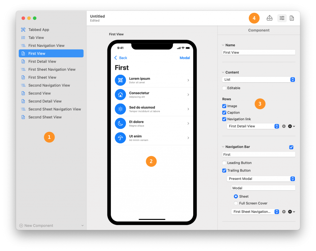
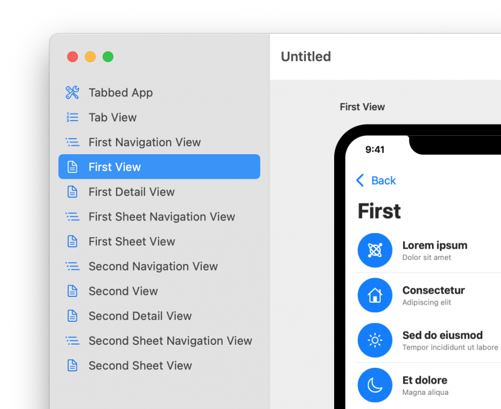
Components define the structure and navigation flow of an app. The components of your document are listed in the outline on the left-hand side of the app window.
You can add a new component to a document by clicking on the New Component button at the bottom of the outline.
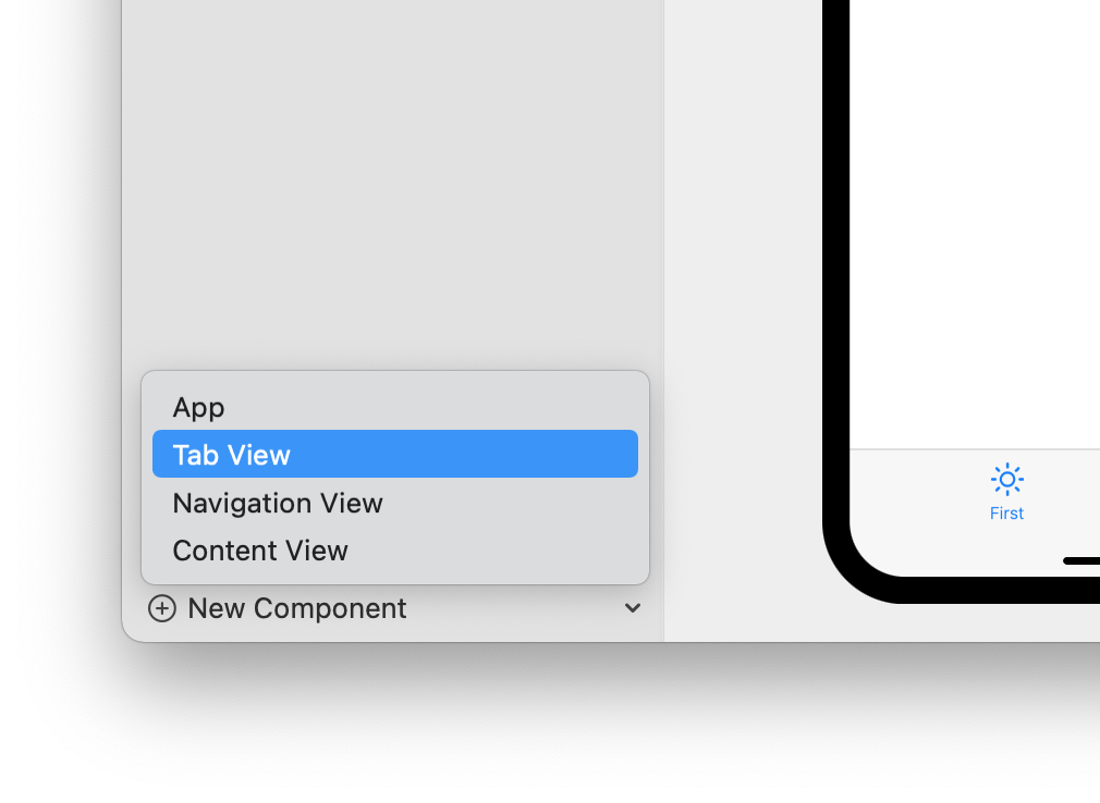
There are four types of components. Of these, only one, the Content Viewcomponent, defines the content of a full app screen. The other three define the structure and the navigation flow of an app.
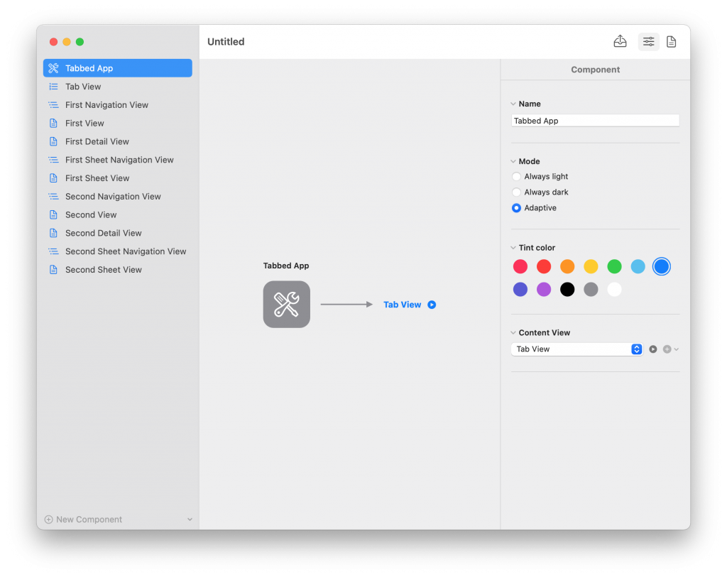
The App component defines the starting point of an app. It allows you to specify general properties for the entire app, like light and dark modes or the app’s tint color.
In SwiftUI, an Appcomponent is exported as a structure conforming to the App protocol, marked by the @main keyword.
While you need only one App structure in a SwiftUI app, Vulcan allows you to have more than one Appcomponent in a document in case you want to define more than one app with similar parts.
The exported structures can be placed in the same Xcode project but need to belong to different targets since only one type per target can be marked with the @main keyword.
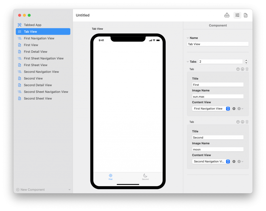
The Tab View component creates tabbed navigation in your app. It allows you to define how many tabs your apps has, their title, and image name (coming from SF Symbols).
In SwiftUI, a Tab View component is exported as a TabView embedded in the exported code for the containing component in the Vulcan document.
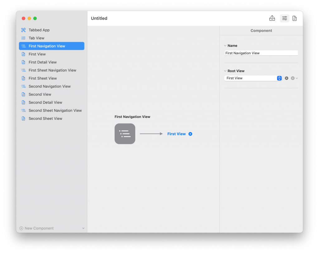
The Navigation View component creates drill-down navigation in your app. This component has no configuration since navigation bars are configured on a screen-by-screen basis (using the Content View component).
In SwiftUI, a Navigation View component is exported as a NavigationView embedded in the exported code for the containing component in the Vulcan document.
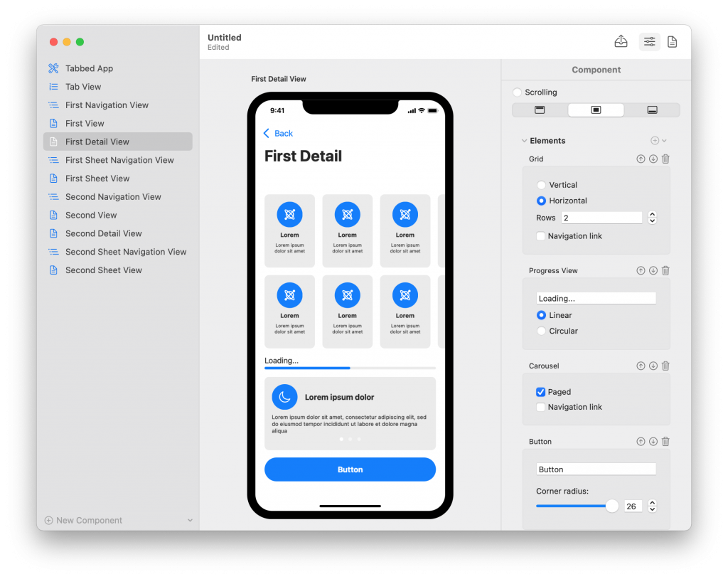
The Content View component defines one screen for your app and all its content. You can also configure the navigation bar for the screen and specify various modally presented views like alerts, action sheets, and custom sheets.
In SwiftUI, a Content View component is exported as a structure conforming to the View protocol. Depending on the content of the component, Vulcan will also generate accessory views (e.g., table rows or grid cells) and Swift data types.
- The Architectural View contentcan contain either a Tab View component or a Navigation View component. This type of content is helpful at the root of tabbed and drill down navigation flows because the
TabViewandNavigationViewtypes in SwiftUI are usually embedded in another view’s body. - The List content creates a scrolling table with configurable rows. In SwiftUI, this content is exported as a
Listview. - The Mixed content allows you to assemble the content of your view using standard SwiftUI views, e.g.,
Text,Button, etc. It also allows you to add and configure composite views like horizontally-scrolling carousels or vertical and horizontal grids.